一段js实现实现手机自适应兼容所有手机和平板
1、基本的属性设置,一般手机页面都会写的:
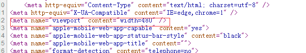
<meta http-equiv="X-UA-Compatible" content="IE=edge,chrome=1" />
<meta name="apple-mobile-web-app-capable" content="yes">
<meta name="apple-mobile-web-app-status-bar-style" content="black">
<meta name="apple-mobile-web-app-title" content="">
<meta name="format-detection" content="telephone=no">
2、这里我新加了一个属性,如图:<meta name="viewport" content="width=480" />。这个480是什么呢,我详细说一下:480是这个页面的宽度,你只需要在排版的时候把页面按照480的宽度排版就可以了。如果你的手机页面是640的,就改成640.
3、加入js代码,如图:/(iPhone|iPad|iPhone OS|Phone|iPod|iOS)/i.test(navigator.userAgent)&&(head=document.getElementsByTagName("head"),viewport=document.createElement("meta"),viewport.name="viewport",viewport.content="target-densitydpi=device-dpi, width=480px, user-scalable=no",head.length>0&&head[head.length-1].appendChild(viewport));
这个代码放到script里面。
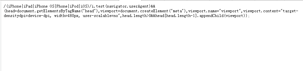
4、这个js片段中的480,就是要和<meta name="viewport" content="width=480" />对应的,切记这是重点,一定要对应了。

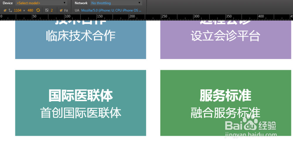
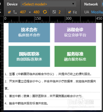
5、效果图:不管是手机还是平板都完全适应。